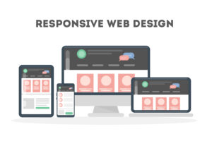
Why responsive web design is good for SEO?
10 min read
1. Introduction
Having a strong online presence is essential for businesses in today’s digital age. One crucial aspect of this is creating a website that not only looks visually appealing but also performs well in search engine rankings. This is where responsive web design comes into play. Responsive web design is an approach to design that ensures a website can adapt and adjust to fit different screen sizes and devices. By implementing responsive web design, you can greatly enhance the user experience on your website while also positively impacting your search engine optimization (SEO) efforts. In this article, we will delve into the reasons why responsive web design is beneficial for SEO and how it can ultimately help boost your website’s visibility in search engine results pages.
2. Understanding the importance of SEO in web design
Understanding the importance of SEO in web design is crucial for ensuring the success of your website. SEO, or search engine optimization, is the practice of optimizing your website to improve its visibility and ranking in search engine results pages (SERPs). When it comes to web design, incorporating SEO best practices from the beginning is essential.
An important aspect of SEO is making sure your website is easily accessible and navigable for both users and search engines. This is where responsive web design plays a significant role. By using responsive design techniques, you create a website that adapts seamlessly to different screen sizes and devices. This provides a consistent and user-friendly experience.
When your website is responsive, it also improves its loading speed, another imp
ortant factor in SEO. Search engines consider the loading speed of a website when determining its ranking in SERPs. A slow-loading website can be penalized and pushed down in search results, resulting in lower visibility and fewer organic traffic opportunities.
Additionally, having a responsive website eliminates the need for duplicate content. With a responsive design, you have a single URL for all devices, making it easier for search engines to crawl and index your pages. This avoids the
issue of duplicate content that can negatively impact your SEO efforts.
Concluding our exploration, seamlessly incorporating responsive web design into your website, especially when looking to “Hire Offshore PHP Developers,” can wield a significant positive impact on your SEO. This strategic move not only ensures a user-friendly experience but also improves loading speed and avoids duplicate content, collectively contributing to an enhanced position in search engine results pages.
3. The role of responsive web design in SEO
Responsive web design plays a crucial role in the success of your SEO efforts. One of the key aspects where it shines is in improving user experience. With a responsive website, users can easily access and navigate your site on any device, whether it’s a desktop, laptop, tablet, or smartphone. This seamless experience leads to longer visit durations, lower bounce rates, and higher engagement metrics, all of which are favorable signals to search engines.
Another important benefit of responsive web design for SEO is its impact on mobile optimization. With the rise of mobile device usage, search engines prioritize mobile-friendly websites in their rankings. By ensuring your website is responsive, you provide a positive mobile experience that can boost your search engine rankings.
Furthermore, responsive web design also simplifies website management and optimization. With a single set of code for all devices, you don’t need to create and maintain separate versions of your website. This not only saves time and resources but also prevents any potential SEO issues ca

used by inconsistent content and URLs.
In summary, responsive web design is an essential element in achieving SEO success. By enhancing user experience and mobile optimization, as well as simplifying website management, responsive design can help improve your website’s visibility and rankings in search engine results.
4. How responsive design improves user experience
- How Responsive Design Improves User Experience
The user experience is a critical factor in the success of any website, and responsive web design plays a significant role in enhancing it. Here are a few ways in which responsive design improves user experience:
Firstly, responsive design ensures that your website is easily accessible on any device, regardless of its screen size or orientation. This means that users can access your content seamlessly, without having to zoom in or scroll horizontally. This enhances user satisfaction and makes it more likely for visitors to stay on your site for longer periods.
Secondly, responsive design allows for automatic adjustment of content and page elements based on screen size. This ensures that the website layout remains visually appealing and easy to navigate, regardless of the device being used. Users can easily find what they are looking for, increasing engagement and reducing bounce rates.
Lastly, with a responsive design, load times are optimized for all devices. Slow-loading websites can be frustrating and a major turn-off for users. By optimizing the performance and load times of your site, responsive design provides a smooth and swift browsing experience, improving user satisfaction and increasing the likelihood of conversion.
In conclusion, responsive web design improves user experience by ensuring easy accessibility, visually appealing layouts, and optimized load times. By enhancing user experience, you can encourage visitors to spend more time on your site, engage with your content, and ultimately improve your website’s SEO performance.
5. Boosting your website’s search engine rankings with responsiveness
- Boosting your website’s search engine rankings with responsiveness
In addition to improving user experience, responsive web design also has a significant impact on your website’s search engine rankings. Search engines, like Google, consider user experience as a vital ranking factor, and responsive design directly contributes to a positive user experience. Here’s how responsiveness can boost your website’s SEO:
Firstly, with a responsive design, you only need to manage and optimize one website instead of multiple versions for different devices. This streamlined approach eliminates the risk of duplicate content, which can negatively affect your search engine rankings. Search engines prefer websites with unique and original content, and responsive design ensures that your content is consistent across all devices.
Secondly, responsive websites tend to have lower bounce rates compared to non-responsive websites. When visitors have a positive experience on your site, they are more likely to explore multiple pages and spend more time engaging with your content. This increased engagement signals to search engines that your website is providing valuable information, which can result in higher search engine rankings.
Furthermore, responsive design plays a crucial role in improving website loading speed. Since mobile devices typically have slower internet connections and less processing power, a responsive website ensures that your pages load quickly regardless of the device. Search engines prioritize websites that load fast because slow-loading websites lead to higher bounce rates and a poor user experience.
Lastly, responsive design also ensures that mobile users can easily share and link to your content. When users share and link to your website, it increases its credibility and authority, positively impacting your search engine rankings. In contrast, if users find it challenging to share content or the website is not mobile-friendly, they are less likely to share or link to it.
By implementing responsive web design, you are not only improving the user experience but also increasing the chances of your website ranking higher in search engine results. The combination of enhanced user experience and improved search engine rankings creates a virtuous cycle that can significantly benefit your website’s overall performance and visibility in search engines.
In the next section, we will delve into the specific SEO benefits of responsive design, including mobile-first indexing and better accessibility for search engine crawlers. Stay tuned to learn how responsive design can elevate your website’s SEO game!
6. Mobile-first indexing and its impact on SEO
- Mobile-first indexing and its impact on SEO
In today’s digital landscape, mobile devices have become the primary means of accessing the internet. As a result, search engines have adapted their algorithms to prioritize mobile-friendly websites. One such adaptation is the concept of mobile-first indexing.
Mobile-first indexing means that search engines will predominantly use the mobile version of your website’s content to rank and index your pages. This shift in indexing practices emphasizes the importance of having a responsive web design that seamlessly adapts to different screen sizes and devices.
By implementing responsive design, you ensure that your website will be properly indexed and classified by search engines. This, in turn, improves your website’s visibility and ranking potential in mobile search results. SunTech Applications is a premier company that works on providing mobile-friendly responsive websites.
Moreover, mobile-first indexing also impacts other crucial SEO factors. For instance, page load speed becomes even more critical as mobile users expect fast and seamless browsing experiences. A responsive design ensures that your website’s performance is optimized across various devices and that your pages load quickly, enhancing user satisfaction and positively affecting your search engine rankings.
Additionally, mobile-friendly websites are favored by search engines when it comes to local search results. As more users rely on mobile devices to find local businesses and services, search engines prioritize responsive websites and provide a smooth experience for mobile users seeking local information.
In summary, mobile-first indexing has revolutionized the SEO landscape, making responsive web design an essential aspect of optimizing your website for search engines. By ensuring your website is mobile-friendly, you are not only meeting the needs of today’s mobile-centric users but also improving your chances of ranking higher in search engine results. In the next section, we will explore the impact of responsive design on the accessibility of your website for search engine crawlers.
7. Common misconceptions about responsive web design’s impact on SEO
- Common misconceptions about responsive web design’s impact on SEO
While responsive web design has become a widely accepted practice for improving SEO, there are still some misconceptions surrounding its impact. Let’s address a few of the most common ones:
Misconception #1: Responsive web design is only necessary for mobile devices.
Reality: While responsive design is essential for providing a seamless experience on mobile devices, it also benefits desktop users. Search engines consider user experience on all devices, and responsive design ensures that your website is optimized for all screen sizes, improving usability and SEO.
Misconception #2: Having a separate mobile site is just as effective as a responsive design.
Reality: While having a separate mobile site can be a solution, it comes with potential drawbacks. Managing multiple versions of your website can lead to inconsistencies and duplicate content issues, negatively impacting SEO. Responsive design provides a unified experience that is easier to manage and more favorable for search engines.
Misconception #3: Adopting responsive web design guarantees higher search engine rankings.
Reality: While responsive design is a crucial factor, it is not the sole determinant of search engine rankings. Other elements, such as content quality, backlinks, and site architecture, also play significant roles. Responsive design supports a positive user experience, but it is just one piece of the SEO puzzle.
By dispelling these misconceptions, it becomes clear that responsive web design is not only beneficial for SEO but also necessary for providing a seamless and user-friendly experience across different devices. In the next section, we will explore some practical tips for implementing responsive design on your website. Stay tuned!
8. Best practices for implementing responsive design for SEO
- Best practices for implementing responsive design for SEO
Now that we understand the importance of responsive web design for improving SEO, let’s dive into some best practices for implementing it on your website. By following these guidelines, you can ensure that your website is optimized for all screen sizes and devices, providing a seamless and user-friendly experience that search engines love.
- Mobile-first approach: Start by designing your website with mobile users in mind. With the majority of internet traffic coming from mobile devices, it’s crucial to prioritize their experience. Optimize your website’s layout, content, and navigation to fit smaller screens, and then adapt it for larger ones.
- Fluid grids and flexible images: Utilize fluid grids and flexible images to ensure your website’s layout adjusts proportionally to different screen sizes. This will help prevent text and images from getting cut off or distorted on smaller screens.
- Media queries: Implement media queries to apply styles specific to different devices and screen sizes. This will enable your website to deliver an optimized experience by adjusting elements like font sizes, layouts, and navigation menus accordingly.
- Optimize loading speed: Mobile users are particularly sensitive to slow-loading websites. Minimize file sizes, compress images, and use caching to enhance your website’s loading speed. This will not only improve user experience but also positively impact your SEO rankings.
- Test across devices: Regularly test your website across various devices and screen sizes to ensure it looks and functions flawlessly. Pay close attention to touch-friendly elements like buttons and menus to ensure smooth interaction.
By adhering to these best practices, you can leverage the power of responsive web design to enhance your website’s SEO performance while providing an exceptional user experience. Also, you can hire top responsive web design services in USA for it. In the next section, we will explore some practical strategies for optimizing your website’s content for responsive design. Don’t miss it!
9. Conclusion: Investing in responsive web design for improved SEO
In conclusion, implementing responsive web design is not only beneficial for enhancing the user experience but also for improving your website’s SEO performance. By following the best practices we discussed in this blog section, you can ensure that your website is optimized for all screen sizes and devices, making it more accessible to a wider audience with expert search engine optimization company usa
Responsive design allows your website to adapt to different devices and screen sizes, eliminating the need for separate mobile and desktop versions. This not only saves time and resources but also ensures consistent branding and messaging across all platforms.
Moreover, search engines like Google prioritize mobile-friendly websites in their search results. By having a responsive website, you increase your chances of ranking higher in search engine results pages (SERPs), ultimately driving more organic traffic to your site.
Investing in responsive web design is a long-term strategy that pays off in terms of improved user engagement, higher conversion rates, and increased brand visibility. So, if you haven’t already, it’s time to make responsive web design a priority for your website.


